Telerik UI for Xamarin Samples
Progress Telerik UI for Xamarin is a library of native and customizable UI controls for building stunning cross-platform mobile applications for the most populate mobile platforms including iOS.
This application shows scenarios developers can achieve using Progress Telerik UI for Xamarin. Browse the examples to get the first-hand experience with the suite. A Source code preview is available for every example.
Progress Telerik UI for Xamarin key components:
Predefined LOB Theme
First built-in theme – Telerik Blue Theme, to deliver a consistent look and feel to all targeting platforms.
Design-Time Support – Toolbox Support
Telerik UI for Xamarin enhances the design-time experience with support for Toolbox by allowing you to drag and drop components on the screen, thus making the screens development much easier.
DataGrid – now RTM
The Telerik UI for Xamarin DataGrid is a powerful and feature-rich control that allows you to easily visualize and edit tabular represented data in your Xamarin.Forms apps. The control provides the ability to easily perform operations like sorting, filtering, grouping, and editing over the underlying data.
Numeric Input
NumericInput is a highly customizable input control for numeric data.
Button
The button UI customization is possible through the pre-defined, provided themes, or you can add rotation, shapes, transparency, text, and backgrounds and images for a custom look and feel.
Entry
RadEntry is a text input control, which accepts string input from the users. Key features:
•Watermark support
•Password
•Support for Different Keyboard Options
•Variety of Customization Options
•Events
SlideView
The SlideView allows users to present content in separate pages and switch between them by swiping.
MaskedInput
Using the MaskInput in your Xamarin.Forms app, you can now ensure correct input is provided by the end users with the support for predefined tokens such as digits, chars, letters, alphanumeric input etc or regex of your choice.
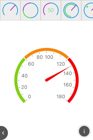
Linear and Radial Gauges
The RadGauge controls serve as instruments that indicate and give a visual display of amount, level, or contents of something.
•Different display layouts
•Linear axis
•Indicators
•Ranges
•Animations
ListView
The ListView provides the most frequently used functionalities associated with a ListView scenario in one and the same framework eliminating the overhead of integrating multiple solutions from different authors. Features:
•Different layout modes.
•UI virtualization.
•Pull-to-refresh.
•Selection.
•Commands
•Cells swipe.
•Grouping.
•Styling API.
Chart
A versatile charting component that offers full customization, great performance and intuitive object model. Its API allows creating complex charts with stunning animations and appearance.
•10+ Chart Types
•Chart Axes Type Support
•Fully Customizable
•Band and Line annotations.
•Trackball
•Pan and Zoom
Rating
Rating is UI component that allows users to intuitively rate by selecting a number of items [stars] from a predefined number of items.
BusyIndicator
BusyIndicator allows you to display a notification whenever a longer-running process is being handled by the application.
SegmentedControl
This component allows you to display a list of horizontally aligned, mutually exclusive options, which can be selected by the user.
Calendar
The Calendar for Xamarin is a highly customizable calendar component that offers different view modes, animations, great performance and customization options.
•Day, Week, Month and Year views.
•API allowing to achieve scheduling functionality.
•Selection
•Flexible Styling API.
SideDrawer
The SideDrawer for Xamarin steps on the popular navigation pattern where you can access all your application screens from a single sliding menu.
TabView
The component is a flexible navigation control that allows you to build tabbed interfaces. Each TabView item has an associated content displayed on selection.


